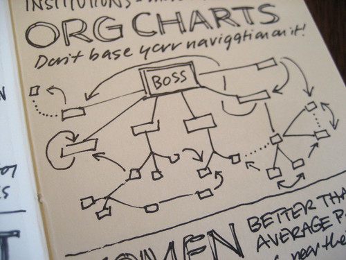
One common piece of an orientation program for new staff or volunteers is a review of an org chart – a chart of the reporting structure of the organization so that everyone knows where they “fit” in the grand scheme of things.
I propose an alternative chart – or at least an additional one.
What about an organizational chart that demonstrates how each person contributes to the mission?
Instead of the Board of Directors and CEO at the top, the mission statement is at the top. Some roles may have a direct link to the mission – those that deliver services to clients, for example. Others may have a role that support the mission down the line. Many roles would likely fit in more that one “reporting line” based on the variety of their duties.
I suspect (since I haven’t actually drawn one of these up before) the resulting chart would look very flipped in many places, articulating the importance of staff and volunteers that might usually show up on the very bottom of a traditional org chart.
No matter what the role, everyone in an organization should be contributing to the mission. Show them how.
3 replies on “Connection to mission: proposing a new org chart”
Hey Trina! I’m glad I’ve bookmarked your blog on my computer. What a great post and a novel idea. I do wonder what such a chart would look like…
Absolutely! I think that might be a difficult org chart to draw, but at the very least I think organizations can do more to connect each employee to the mission through alignment from mission down to the individual performance plans of each employee. And maybe some volunteers, while you’re at it!
Great topic, and one that I might expand on soon on my blog, if I may be so bold. And congrats on joining the young bloggers’ alliance – I can’t wait to read what that amazing group has to share with the world!
Virginia – I challenge you to a mission org chart drawing competition in your next job and mine! I agree it could be tough and messy, but time to put ideas into practice!